Graph ATD360
This One Helps You In : User-Flow, Data Analysis, Information Architecture, and Research Method Selection✨
ATD is a highly sophisticated web application designed for security operation centers. Its primary function is to detect advanced network threats and generate an alarm for each set of events that match our pre-defined rules. The end-users of the application are security specialists who analyze alarms on a daily basis and make decisions based on the level of threat detected. When I joined the team, I was faced with the daunting task of tackling the complexity of this "Spaghetti Product".
Intro
“Graph” is a medium-sized enterprise with four distinct products: FAM (File Analysis Module), EDR (Endpoint Detection and Response), ATD (Advanced Threat Detection), and SandBox. While each product is sold separately, they are all interrelated and require data sharing to function effectively.
For instance, suppose a security specialist receives a threatening alert on ATD, indicating that a malicious file has been uploaded to their mail server. The next step would be to analyze the file using FAM to determine if it is indeed infected. If the file is not detected, the behavior can be manually explored using Sandbox. From there, the specialist may need to search for other instances of the file beyond the mail server and remove it from all agents containing the file with the help of EDR.
Without a system of interconnected products, managing these communications manually would be an arduous and time-consuming task.
To comply with my non-disclosure agreement, I have omitted and obfuscated confidential information in this case study.

THE CHALLENGE
My initial observation from the Marketing team was that the product was not user-friendly without the assistance of the Graph support team. This was evident as even our colleagues struggled to work with the application, especially when communicating across the four products.
To address this issue and regain lost customers, our objective with the new platform is to incorporate all features of the four products within two years without the need for support assistance. Our high-level goals for this initiative include:
- Developing an intuitive platform that is easy to use and does not require support from our team.
- Integrating the features of all four products into a single solution.
- Enhancing the flow of data between components, thereby eliminating any disruptions.

My Role
When I first joined the team, there was no designated designer. The ATD product had been created solely by developers without any input from other roles, leaving me to take on the responsibility of the entire design process.
During the early stages of development, I served as a researcher, delving deeper into the problem than the marketing team had done previously. As the project progressed, I took on the additional roles of interaction designer, UI designer, and test manager, all while continuing to conduct research. Despite the numerous responsibilities, I am proud to say that I was able to achieve a significant amount.
The KickOff
At the onset of the project, I encountered a significant challenge in defining a clear mission and specific goals for the new platform, given its vast scope. To better understand the user requirements and how our support team could assist them, I conducted contextual inquiry research with eight participants who were experts in SOC operations. This research allowed me to gain insights into their current product usage behaviors and mental models.
The research uncovered several key findings, including:
- The main section for data was deemed useless by most users, who instead relied on the forensic feature, resulting in the need for multiple open Chrome tabs and difficulty navigating between them.
- Nearly 70% of users were not aware of the full capabilities of our product due to the lack of an automation feature. As a result, they had to manually search for key values and related hosts for every alarm generated, while our backend could have automated this process.
- Users struggled to understand the flow of threats and attacks despite this being the product’s core value as intended by the development team.
- The asset management feature was not satisfactory, and the EDR module lacked essential data that was not being sent to the UI.
The Process
After the initial research phase, stakeholders expressed a preference for a complete redesign of the product, but due to production constraints, this was not feasible. As a result, I developed a customized design process for our new team with a focus on several key objectives:
- Ensuring the maintenance of our current selling products.
- Defining our primary persona.
- Restructuring the scenarios based on the daily work process of our persona.
- Prototyping new solutions for the new IA.
- Testing the new solutions.
As part of this process, my primary responsibility was to focus on the development of a new all-in-one product, ATD 360. We recognized the need for a dedicated designer to work alongside our team to address current usability issues during the maintenance phase
Discovery
🎯 First Attitudinal Research: What Are We Solving?
To better understand the needs of our users, I initiated a research process consisting of one-on-one interviews with 10 participants over the course of one week. As a first step, I created a screening document in collaboration with the product manager to identify and select suitable participants, and planned the logistics for the interviews including scheduling and location arrangements.
During the interviews, which were conducted in a hybrid format, I prepared a list of targeted questions and topics to discuss with participants, tailored to their daily work processes. Following the interviews, I analyzed the data and generated an affinity diagram to better visualize and understand our users’ needs, ultimately leading to the creation of our first user persona.

What They Said
- Checking alarms manually was a pain point for them as it was time-consuming and prone to errors.
- They needed a system that could group similar alarms together and provide them with relevant information at once.
- They wanted a way to prioritize alarms based on severity and potential impact.
- The lack of automation was causing them to miss some critical threats and they wanted a more proactive system that could alert them in real-time.
Based on these findings, we started to develop a new solution that focused on automating the alarm management process, grouping similar alarms together, and providing contextual information to SOC analysts in a more efficient way. We also prioritized the severity of alarms and developed a system that could alert analysts in real-time when critical threats were detected.
🌀 Second Attitudinal Research: Why Are They Selecting This WorkFlow?
During my research, I sought to gather domain-specific knowledge related to network security. In order to accomplish this task, I concurrently reviewed the university’s security book to better understand the challenges being faced in the absence of ATD. In the second week of my research phase, a significant breakthrough was achieved. Through careful analysis, it became apparent that the key to understanding the issue lay in identifying the relationship between alarms. Specifically, the security team was manually cross-referencing alarm values to determine whether or not there was a connection between them. For instance, if an ATD-generated alarm indicated a malicious file, the team would investigate whether or not that file was present on other hosts or identify its origin. By discerning the relationship between alarms, numerous questions could be answered. To our surprise, the SOC team was utilizing this technique with our product, although we had not planned nor implemented this feature.


Insights
Upon obtaining new insights, I initiated the creation of a redesigned information architecture (IA) for our forthcoming all-in-one platform, ATD360. To achieve this goal, it was imperative to establish frequent and robust collaborations with our engine, back-end, and data analysis teams. Our main challenge was to devise a new methodology for extracting relational insights from the data. Our existing data structure was complex and disorganized, making it difficult to identify patterns and extract meaningful information. To overcome these obstacles, we followed the following steps in close collaboration with our engine, back-end, and security data analysis teams:
- Reframed the problem with the new user flow in mind by identifying the types of relationships between alarms in real attack scenarios, determining which key values were useful in different alarms, and discerning which data sections were being used manually in actual attack scenarios.
- Created a new IA based on our current data structure on the back-end and engine side. This proved to be the most challenging phase of the design process.
- Shaped the user flows based on the updated Persona behavior to ensure a seamless and effective user experience.
The new ia

Initially, I had numerous ideas racing through my mind, and I struggled to discern which would be most effective in crafting a compelling relationship presentation within alarms. I asked myself, is it feasible to automate the process, or is it best suited for a human touch?
To begin, I thoroughly examined 120 genuine alarm data sets and drafted a comprehensive alarm data structure that incorporated both crucial and less significant fields and key values. By selecting alarms that had been generated at various times and on different dates, I ensured that no bias would be introduced.
Next, I identified the most prevalent attack scenarios and closely scrutinized the essential fields and key values of each alarm that was associated with a particular scenario. This method was similar to the daily workflow of SOCs utilizing our alarms.
Ultimately, this approach yielded a set of crucial key values that were pervasive across all alarms and repeatedly appeared in the majority of attack scenarios.
🛠 Third Attitudinal Research: How Can I Find The Pattern?
Firstly, I decided to conduct card-sorting research to identify how our key values can be grouped. The results of the card-sorting exercise proved to be invaluable after the initial data analysis. I discovered some key values that were common among the most important alarms, but the challenge remained – how do we present these insights to our Persona in a meaningful way?
Our solution was to group the key values and create a new flow to address the problem statement identified in the early phases of our research. To validate our solution, I ran a card-sorting session with eight participants selected by our Persona. The session was a success and I was able to identify the first semantic grouping of key values between alarms. This was a glimmer of hope in the pitch of darkness and I felt confident that I was finding the elementary pattern to show the relation between alarms.
After the card-sorting phase, I used my findings to create the first version of our new product, ATD360’s IA. Our new form of data presentation was named “Profiles” and this was just the beginning.
The new FLOW : the insights inside alarms

To optimize the use of our “Profiles” solution for data presentation and alarm relation extraction, I decided to create a new flow. Our goal was to provide our Persona with the insights they wanted without the need for manual searching between alarms. To achieve this, I went back to the interviews and listened to their voices once again. I reviewed how they worked and what insights they really wanted.
However, I didn’t feel confident with just the voices I had. As a product designer, you always want to be sure that you are on the right track. Unfortunately, there was no time to conduct new research. So, I tried to find patterns with the existing data and discovered some key insights.
Firstly, there was always a point that connected alarms to each other, such as the host, IP, file, or connection. Secondly, hosts were always important, and one of the most common tasks they performed was checking the source or destination hosts. Thirdly, following clues was the primary reason for back-and-forth searching. Lastly, applying commands and actions was the most challenging job for every type of element, and they acted differently.
After analyzing the data, I began creating an algorithm that would make these connections. The algorithm was the answer I was looking for, and I believed that it was all I needed to create my new user flow.
The Algorithm: Is it how designers solve a problem?

Well, No!
To solve the problem of manual searching between alarms, I created an algorithm that would show the connection between them. At first, I was hesitant to present the algorithm to the super professional SOCs team, but I persevered despite facing issues with the back-end team.
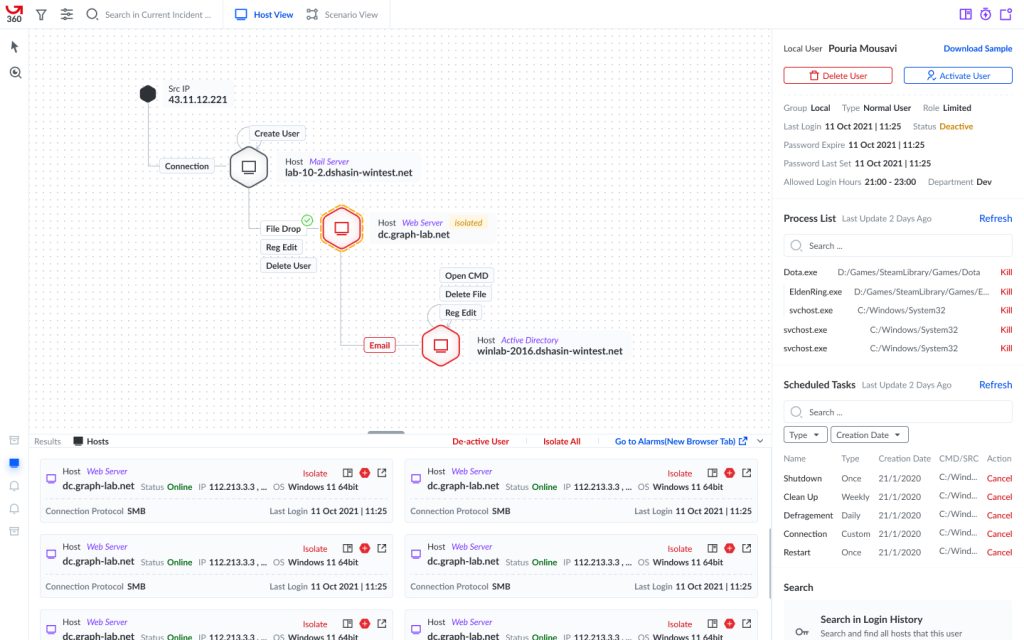
My solution was based on a graph, where nodes represented hosts and edges represented the events that occurred to them. I chose a graph because I needed a connection-based diagram that was interactive and could present a scenario.
The first version of the graph showcased a simple attack scenario based on the alarms we already had. After conducting a heuristic study with the previous 8 participants, it was evident that everyone loved it!
In the subsequent versions, we added other types of actions and connections, making the graph more complex. Eventually, we arrived at a graph that included profiles showing the grouping of key values based on alarm type, and the relation between alarms was fully visualized without the need for manual searching.
The usability test was the next step in our journey.

Wait! Profiles?
Yes! My first solution to get a better structure on key values in an alarm was based on card sort research. I brought profiles to nodes and edges, which led to a fluent experience in drilling down to the root cause of an alarm.
Before the test phase, I was excitedly thinking to myself, “This is exactly what they want!” For the first time, I felt confident with the solution I had come up with.

How Does it Work?
While we didn’t remove the manual data extraction from alarms, we introduced a new user flow called “Incidents.” This panel displayed a list of graphs created by our algorithm based on a set of alarms. By selecting a graph, all hosts involved in that set were displayed as nodes, and the actual events as edges. With just one look, it became clear how those sets of alarms were connected to each other.
From there, users could easily drill down and search for important key values. And the best part? Profiles were already there, customized for the specific alarm.
Does it Work?
We initiated the project with a cohort of 12 new participants, and subsequently conducted a usability test phase. The results demonstrated an impressive 92% task success rate and 83% satisfaction level, which although not ideal, served as a promising start for our novel platform. Subsequently, we created a specialized section of the platform exclusive to our loyal users, and began monitoring their activity via Hotjar. Upon analysis of the obtained data, we made the following observations:
- While the primary solution was functional, many users still relied on manual drill-down features and alarms lists in numerous scenarios.
- Our profiles were limited to a single-level categorization, whereas users required greater depth and specificity, such as searching in other hosts or mail servers.
- File transfers to antiviruses and subsequent results retrieval continued to pose a challenge.
- During attack scenario testing, Sandbox was employed as a separate platform, rather than being integrated into the primary one.
Next phase
Our primary algorithm and solution were embraced by the users who expressed a desire for additional features. This presented a crucial juncture in our journey, as we required a new design team to develop the features that our data indicated were necessary for scaling. We proceeded to onboard two new designers, though initially, their abilities could not be fully utilized. It was necessary to acclimate them to our domain and ensure a seamless integration into the team.
While the designers focused on improving usability KPIs and maintaining the current solution, I began formulating research plans for future endeavors. Among my priorities was establishing a streamlined flow between our FAM and Sandbox products. Additionally, I sought to implement a new search feature in our graph view to enhance functionality.

FAM & Sandbox: What are they solving?
In order to understand why users were utilizing our product and how they were doing so, we conducted a contextual inquiry. The findings were straightforward on an abstract level: Antiviruses! Our FAM product provided users with access to 13 different antiviruses that could scan a file and generate a comprehensive report on the infection rate and level of confidence regarding the likelihood of the file being infected.
However, the effectiveness of FAM was not infallible, as new strains of malware and trojans were emerging that could evade antivirus scans. To address this concern, we developed the Sandbox product. Sandbox provided users with a safe, customizable virtual environment in which they could run a file and obtain a detailed report of the behavior exhibited during file execution, along with any enabled indicators.
Despite the efficacy of both products, many users were compelled to leave the graph view in order to upload files to either FAM or Sandbox, causing a disruption in the user experience.
Embedding Sandbox & FAM to The New Graph
To address this issue, I decided to integrate the FAM and Sandbox results alongside every file, process, and email in the attack scenario, rather than requiring users to navigate to separate sections. By repeating the Profile solution, which had previously been utilized for hosts and key values, for all individual elements in the attack scenario, I established a pattern that users could recognize and seek out for structured information.
To display the FAM results, I created a new section within the Profiles that showed all antivirus results without requiring any action from the user. This made the FAM results visible and easily accessible when viewing the file profile.
However, incorporating Sandbox results was more challenging. FAM queries were lightweight and could be processed in seconds, but Sandbox was a time-consuming process that could significantly impact the optimization of the graph view feature. As a result, I designed the Sandbox section in a way that required users to actively request the results, with the understanding that the process would not be instantaneous.

They Were Still Getting Out of the Graph View Page😭
Despite the addition of FAM and Sandbox to the profiles, there were still scenarios that required a manual search, as the graph view was limited in its functionality. This was due to the fact that while the new graph view displayed connections, it did not provide actionable steps for users to take. For example, if a malicious file was discovered in the graph, SOC analysts may want to know which other hosts also had the file and which of those hosts had executed it. Additionally, if they wanted to remove the file from all hosts on the network, they were left without guidance on how to do so.
It was clear that one crucial piece of the puzzle was still missing…
Profiles v2
Initially, I had anticipated that the Profiles feature would be representative rather than interactive. However, it became apparent that we needed to incorporate the main actions that Security Operations Centers (SOCs) were already taking through query writing. To this end, I collaborated with our back-end team to source the relevant data. I posed a question to them about the most frequently used queries emanating from the alarm list.
Following their response, I presented the queries to our Cyber Security Manager for sorting, after which I conducted a brief Closed Card-Sorting research to categorize them according to the existing profiles. The outcome was a comprehensive set of actions aligned to each profile type, which proved to be a significant achievement considering the simplicity and swiftness of the research process.
Profiles v2, therefore, offered a novel approach to displaying essential values while facilitating action based on the data type. For instance, with the new feature, users could readily remove a malicious file by simply clicking a button, without the need to write a query specifying the file and the host.
However, a challenge arose when the team sought to remove the file from all the containing hosts.
Results: The New Panel

Our team learned from our initial vision that information presentation alone was not enough, and we needed to prioritize user interactions as well. One area that needed improvement was searching within our system, as SOCs were spending significant time manually crafting long search queries.
To address this, I reviewed our data and identified the most common search queries. I then incorporated these queries into the profiles section and created a new panel to display the results, aptly named “Results.” To keep all results in one place and prevent users from switching between multiple pages, I used a tab pattern.
In a subsequent usability test phase, we saw a significant decrease of 95% in page switching, indicating that our new design was more efficient for SOCs to use. However, we continued to monitor other KPIs to ensure a holistic improvement of our platform.
The Impact
Since the inception of the project, I have been meticulously curating a list of key performance indicators (KPIs) that required enhancement. I ensured that this list was continually updated in every stage of feature development. At present, I am pleased to present the final version of this list, along with the results from the latest usability test.
| Usability KPIs | Zero State (Before Design Team) | First Phase(Graph) | Second Phase (+The Profiles) | Third Phase(+Results) |
|---|---|---|---|---|
| AVG Task success rate | 90%(It is for manual alarm analysis) | 82% | 90% | 90% |
| AVG Error rate | 5% | 8% | 3% | 3% |
| Page Switch | 100% | 80% | 65% | 30% |
| User satisfaction | 25% | 60% | 60% | 75% |
| Attack Scenario Detection | 80% | 75% | 80% | 85% |
| Manual Alarm Analysis | 100% | 80% | 65% | 40% |
| Support Call per Attack(MDR) | 75% | 80% | 75% | 60% |
| FAM API Call | 0% | 0% | 100% | 100% |
| FAM Manual Access | 100% | 100% | 20% | 20% |
Never Enough! Never! Never!
As we continued to develop new features for Graph ATD360, we encountered new challenges that needed to be addressed. For example, there were certain queries that required more time to generate results, and there were certain actions that our users wanted to take automatically. To tackle these issues, we developed three new features: Queueing, Auto Response, and Business Rules. These features were designed to improve the user experience by streamlining certain tasks and automating certain actions, while still ensuring that our platform remained efficient and effective.
Issues and Barriers I faced: Was it that simple?
During the minimal version of the new ATD360 solution, I had to go through several challenges.
- Firstly, I had to convince the development team that an automatic version of data extraction was feasible. This was not an easy task, as it required a significant shift in their mindset and approach.
- Additionally, gaining access to SOCs proved to be another challenge. Security analysts are a demanding persona to work with, as their tasks are varied and their goals frequently change throughout the day. As a designer, I had to be flexible and adapt to their ever-changing needs.
- Uncertainty was also a significant challenge throughout the project. At no point could I be certain that I was developing the right solution, and this made the process both enjoyable and frustrating.
- Moreover, I had to learn a lot about the security domain. Reading and understanding security-related material was a difficult yet rewarding experience.
- Lastly, I had to manage another designer who was maintaining the current ATD product while simultaneously adding features to the new solution. This required effective communication and collaboration to ensure that both projects were progressing smoothly.